I took a peek at the new TradHome Spring 2012 issue over the weekend and was totally blown away. With so much eye candy, it went from sheer delight to I dare say overload (in a good way)! I actually had to take a break midway through for fear that I had reach maximum capacity and was missing things I needed to see (I'm not even kidding). This is not normal for me. Usually, I can breeze through a magazine, antique market, or website and find only a few interesting things to think about. But every single page of this issue had at least one (and usually more than one) scrumptious morsel.
Just a few of my favorites - Oh, one major caveat before I begin . . .
If you are trying to refrain from changing your interiors or (following April 15th) your pocket book is not very user friendly, you will want to skip my post today. :)
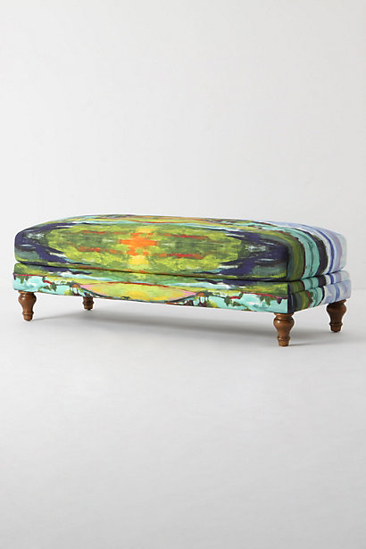
For starters, I loved the "Designer's Picks" section with lots of finds I had never seen before. Especially this bench from Anthro. Very good.
Then on to this fabulous DIY artwork of framed fabric - More love.
The possibilities are endless here, and I will be incorporating this idea into some of my design projects.
Then, this article - Two fabulous girls who have organized a group of interior designers to create some wonderful rooms at the Good Shepherd Center for Homeless Women and Children in L.A. If this article doesn't make you realize how important it is to create a wonderful space to come home to, then nothing will.
And, I'm only scratching the surface! There were so many wonderful articles with stunning images. No skimping here. A large section of the issue was devoted to "Trads 10" up and coming interior designers to watch. I loved that each designer had a very unique take on design, and all were stunningly beautiful.
Pops of emerald green - genius.
And Birmingham Designer - Tammy Connor! And let me say Tammy's personality is just as wonderful as her design sense. She truly is one of the most unassuming designers I've ever met. And her style is timeless.
Lacquered ceilings - holy smoke.
Nick Olson - This room made me think about my up and coming living room! The black and red are so wonderful in this space. It feels very eclectic and high end.
More pops of color in a neutral space. Also, I thought all her rooms felt so fresh - perfect for the season.
Dreamy grey kitchen. You have to see all the other images they feature on her. Every last one was amazing.
The midcentury modern vibe here almost did me in! Just look at that sectional, artwork and my goodness, those curly brass sconces. Swoon.
This is not even all of them! There are more to be seen if you click over. Oh, and in case you're wondering, no, I am not being paid to say all this! This issue is just that good.
When you have more than a minute, you NEED to go check it out! Happy Day. M.


No comments:
Post a Comment