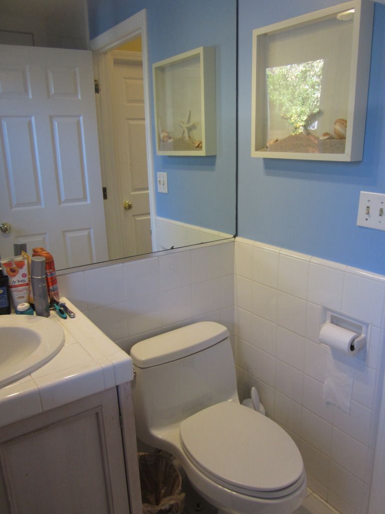
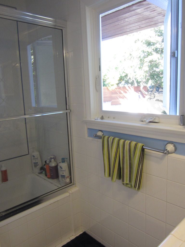
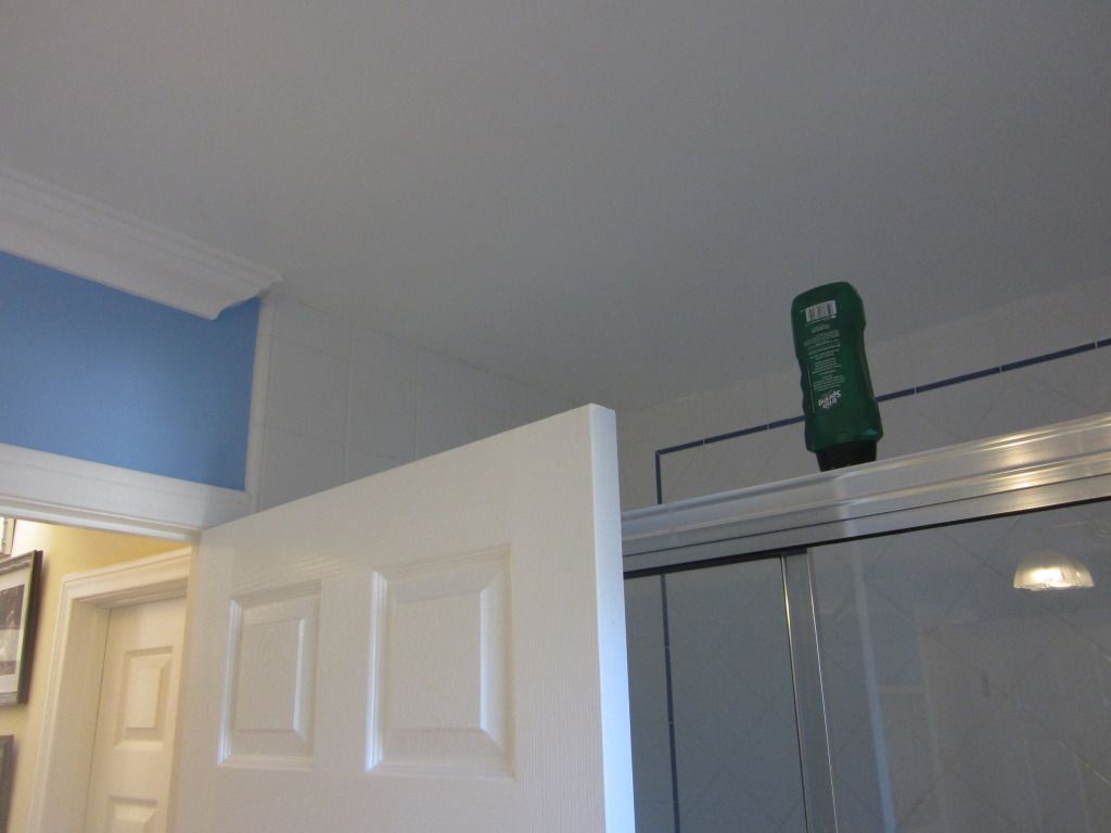
Hello all! We have the beginnings of a new project to share with you today. This bathroom has storage issues and definitely needs a fresh, updated look. As you can see in the photos below, most of the toiletries are crowded on the vanity counter top since there is not enough storage space. The original space has a bit of a coastal theme, but the overall look was just a little outdated (hey, it happens). Take a look for yourself!
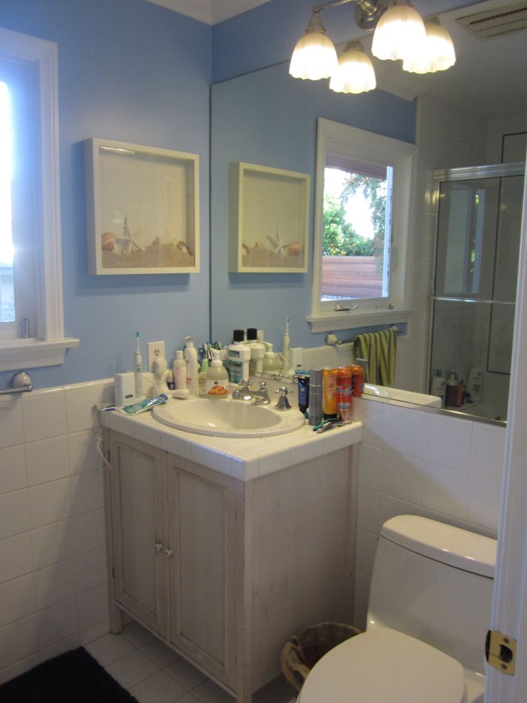
Our goal is to transform this bathroom into a tranquil haven with improved functionality, oh and be beautiful of course!!
And spoiler alert... this Vihari irridescent green glass tile is going to be the star!!
A Lot Of Guide, Tips, Resource, Image, Style, Article About Interior Design Ideas For Blogger
Last 7 days Popular Posts
-
After spending the last 2 years living in the city of San Francisco, the owners of this beautiful 1904 California bungalow in Marin decided ...
-
ryan korban was featured in the most recent issue of lonny . when i saw his space, i felt like it was one of the better rooms within that i...
-
I love the clean lines of the roman shades in both spaces. Perfect with the thick casing I think! images via pink wallpaper
-
Just a quick peek at my weekend in review from my instagram pics of Atlanta. I had a really great time and was very happy with my first t...
Tuesday, May 15, 2012
ZE Interior Designs »
GEORGE projects
» A Bath by the Sea, Part I
A Bath by the Sea, Part I
Labels:
GEORGE projects
Subscribe to:
Post Comments (Atom)
No comments:
Post a Comment