I've wanted to feature this uber talented husband/wife team for quite some time. This wonderful duo has created a very special company of custom bespoke cabinetry in Birmingham, Alabama. Their custom designs can be seen in some of the most prominent homes in our area. They've also been featured in numerous magazines and show homes over the years.
Interestingly, they do not have a website, only a Facebook page. The reason - they don't need a website. Their work is the only advertising they seem to need. So, I'll do the same here with just a sampling of the awesomeness simply known as Cantley and Company.
Marble detailing around a sterling silver sink (yes, I did say sterling silver).
Ceiling - need I say more.
What a fabulous place to serve a drink.
The details in the kitchen below simply blew my mind. Most kitchens you see these days are all tripped out with marble, including the focal point area behind the stove. Look closely here, the area is made of plank boards and gorgeous detail trim - all done in wood. Talk about a price savings, and it's lovely.
Here's a close up. This is a very clever way to save some money - also the perfect pairing with those oversized rustic wall sconces with linen shield shades.
One other clever detail. Notice the upper cabinets - not unusual to see glass fronts on cabinetry. But it is unusual to see glass wrapped around the sides. It gives the cabinets a completely different look and feel. Amazing how such a small detail can transform a kitchen. Simply love this.
In the image below, I would never have thought to use the old fashion school house blinds in this kitchen. But it gives the perfect amount to dark color to tie in the lighting and the stained wood island.
I really think this family owned business has a very special thing going. Such Wow factor is very difficult to achieve, and they pull it off effortlessly. M.
Interestingly, they do not have a website, only a Facebook page. The reason - they don't need a website. Their work is the only advertising they seem to need. So, I'll do the same here with just a sampling of the awesomeness simply known as Cantley and Company.
Marble detailing around a sterling silver sink (yes, I did say sterling silver).
Ceiling - need I say more.
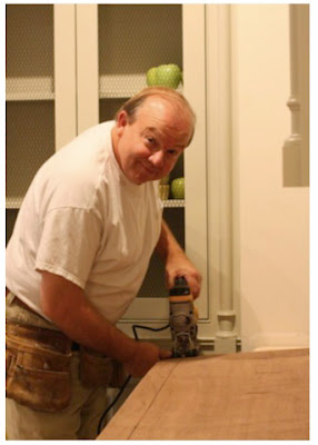
Here is a cute picture of Keith Cantley doing what he does best!
What a fabulous place to serve a drink.
The details in the kitchen below simply blew my mind. Most kitchens you see these days are all tripped out with marble, including the focal point area behind the stove. Look closely here, the area is made of plank boards and gorgeous detail trim - all done in wood. Talk about a price savings, and it's lovely.

Here's a close up. This is a very clever way to save some money - also the perfect pairing with those oversized rustic wall sconces with linen shield shades.
One other clever detail. Notice the upper cabinets - not unusual to see glass fronts on cabinetry. But it is unusual to see glass wrapped around the sides. It gives the cabinets a completely different look and feel. Amazing how such a small detail can transform a kitchen. Simply love this.
One last view of this kitchen (sorry it's blurry), notice the open shelving and cabinetry near the door (to the right). It gives this kitchen a very eclectic (I dare say modern) element. Just love it.
In the image below, I would never have thought to use the old fashion school house blinds in this kitchen. But it gives the perfect amount to dark color to tie in the lighting and the stained wood island.
Another detail (in the image below) which really makes a huge difference - notice the stained wood trim between the two windows in this image. Your natural instinct would be to paint that trim out the same as the cabinetry. But by choosing to stain it the color of the blinds, the window reads as one large window rather than two small windows. The color again helps to tie in all the other dark brown elements in the space. Perfect solution.
I wanted to include this one to remind you that custom cabinetry is not just for the kitchen. Look at the lovely curved tub and furniture detailing on the base of the built in cabinetry.
More goodness.
I really think this family owned business has a very special thing going. Such Wow factor is very difficult to achieve, and they pull it off effortlessly. M.


No comments:
Post a Comment