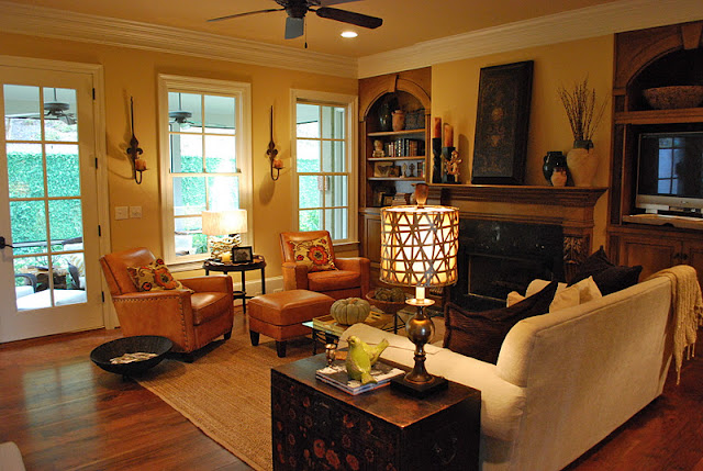
I thought you might like to see what I've been doing with my time lately. This is a redesign I've been working on for a incredibly fun client in Vestavia, Alabama. For redesigns, I take a client's current furnishings, and completely rearrange each room. I move pieces from room to room, rehang artwork in new and fresh groupings, and totally restyle all accessories in the space.
When I finish, the client has a brand new space. Short of painting, redesigns are the most affordable way to achieve a new look in your home. Once I complete the process, I like to make suggestions on new pieces to enhance the space. No more anxiety over wondering whether a piece of furniture you find will actually work in your space. You will know exactly what to look for when you're out shopping.
When I finish, the client has a brand new space. Short of painting, redesigns are the most affordable way to achieve a new look in your home. Once I complete the process, I like to make suggestions on new pieces to enhance the space. No more anxiety over wondering whether a piece of furniture you find will actually work in your space. You will know exactly what to look for when you're out shopping.
This is the first thing you see when you enter the front door. This space had several small pieces - a chair, small round table and several items hanging on the wall. I took a less is more approach and selected one large scale table, with a custom pleated skirt. This table is the only new furnishing purchased by the homeowner for this entire redesign. All the other furnishings they already had in different rooms of their home.

Here's a close up of the tape we included on the bottom for interest.

And we topped it off with a custom aged mirror top for some sparkle and glamour. I then added a bowl of pumpkins for the season. All the other accessories, the homeowner already had in other rooms of her home.

This family lives in every single room of their home. This is one of their main living spaces.
The doors to the left lead to a screened porch while the doorway to the right leads to the kitchen and den. The parsons chairs flanking the chest were originally in the dining room, the artwork was over the mantle and the olive jars were in the bookshelves.
The client has an amazing collection of olive jars, so I highlighted a pair of them here.
This view is looking back towards the front door. I moved the low console table in from her master bedroom. Originally, there was a large asian inspired armoire on this wall. I think the console gives the space a more open feel while the artwork grounds the wall and gives it impact. Also, love the large artwork on the wall leading into this space.
Here's a close up of the bookshelves to the left of the fireplace.
The console had crystal knobs giving it a bedroom feel, so we changed them out for these brass pulls - simple change but lots of impact.
And last, but not least - this photograph of their spunky dog, Chet. He's so adorable!
I have pictures from other rooms, but I am out of time for today! I promise to share more soon. M.
PS: Blogger has not been cooperating with me on my giveaway. Thanks for the emails about this. I will try to fix the problem today on being able to leave a comment on the giveaway page. If any of you bloggers out there have a trick, I would love to hear it!


No comments:
Post a Comment